When it comes to email marketing, the color scheme may make all the difference in terms of efficiency and helping consumers notice the call to action. Every element of an email campaign has an effect on how well it performs. Nothing has a greater impact on a reader’s subconscious than color combinations. Every marketer should be well-versed in color psychology in order to better promote their goods and convert leads because each color delivers a specific message.
So, how many colors should your email contain? How do you mix and match colors? Is it better to have a warm or chilly hue for the CTA button? Let’s find out.
There are a few things to consider when choosing colors for the design of your emails. First and foremost, you must understand the meaning of the colors you are considering.
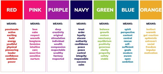
Here’s a brief chart that shows what emotions each color is likely to elicit, as well as what influence it might have on the reader.

Source: ManyPixels
As you can see, using red to evoke a sense of confidence, passion, or excitement in the reader is a good idea. If you’re marketing a new product or having a flash sale, it would be excellent to motivate people to act. Use navy blue in your CTAs, on the other hand, if you want to remind your email subscribers that your company is trustworthy, loyal, and responsible. This will make them feel confident in their decision to cooperate with you because you are trustworthy and authoritative.
Best Practices for Using Colors in Emails
1. Recognize your target audience before launching your colorful emails
Understanding your target market is critical for any form of organization. You must understand your target audience, including their age, gender, and culture. Purple is seen to symbolize monarchy in some places, but it is considered a death sign in Italy.
As a result, you should be quite familiar with your customers’ characteristics. If you don’t, you’ll run into problems after sending an email. This is when customized email comes into play. This suggests that pink is a popular hue among women, but black is a popular choice among men.
2. Align the various colors to balance the impact
Always attempt to keep the colors in your email or newsletter balanced. Use colors that are the same or similar throughout your newsletter. Use the same technique in the header and footer sections, for example. That implies that the header and the footer must be the same color. This will improve the appearance of your email or newsletter.
3. Do not get mixed up with the colors
In general, the body of a newsletter or email consists of three parts:
- Background information – Covers the majority of the newsletter’s content
- First-person perspective – The main email body
- Color that stands out – Buttons and highlighted important parts
In these parts, you can use three or four extra colors. However, be sure that the colors you choose don’t add to the heaviness. However, it is dependent on the design of your newsletter or email template. As a result, you must select the appropriate email template in order to make effective use of colors.
4. Make Colors Work for You
The way you present your email or newsletter has a significant impact on your email engagement and conversion rate. Again, depending on where the text is, utilize white, light grey, dark grey, or black colors for your text if you want to keep it simple and profitable.
Alternatively, you might use the following guidelines:
- If the writing is on a bright, colorful, or dark background, keep it white or light grey.
- If the background is dazzling white, use black or dark grey in the text.
- If you wish to utilize different colors in your text, remember that any color looks great against a white or very bright background.
5. A/B Test the Color of Your Email
Another crucial aspect to remember is that you should always A/B test your experiments. This will show you which colors are effective and which are not. Furthermore, you’ll have a clear picture of which color generates the most engagement and conversions.
However, one thing to remember is to employ a variety of colors in a single segmented list. If you utilize alternative email lists, you can achieve the required results.
Recap
Overall, if you want to make your email more appealing, stick to these easy guidelines:
- Make your email readable by using three colors.
- Choose and use the company’s corporate colors if you don’t want to pick a color for each new campaign. Your emails will become more recognized as a result of this.
- Check to see if your email is simple to read: some colors don’t mix well.
- To make the CTA stand out, use one main contrast color.
- Use different colors for different effects: bright dynamic colors to elicit a response, neutral and dark colors to relax.
- Use naturally existing color combinations instead if you’re not good at color pairings.
Remember that everything is dependent on your clients’ tastes, which is why you should test each font and color on the audience you’re delivering to get the greatest results. Bright colors, achromatic colors, and shades are preferred by most men, but soft colors and tints are preferred by most women. In a nutshell, segment everything you possibly can.


