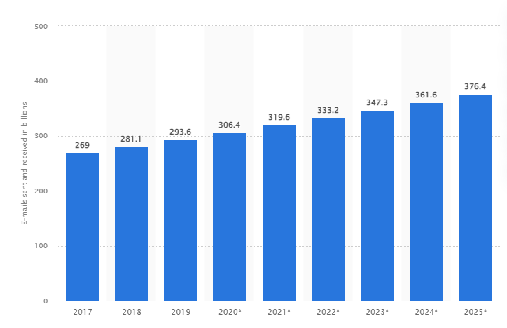
Professionals working in companies all over the world receive more than 120 emails per day on an average. The following graph shows the number of emails sent and received worldwide from 2017 to 2025, 333.2 is the value estimated for the upcoming year.

Source: Statista
These numbers are intimidating and might even demotivate a marketer into thinking that the whole email marketing effort is futile. After all, how can someone propagate their message when there is already so much of noise?
Now consider this: email marketing, when compared with the ever popular social media, generates 40 times more leads. And there is also a return of $42 on every single dollar spent on email marketing.
Email marketing, therefore, is the strategy that is used tremendously by businesses all over the world. And, if done right, it has remarkable scope of customer acquisition and retention. The trick is to send emails that are highly engaging.
Interestingly, visuals are known for being highly engaging form of content. Visual information accounts for 90% of the information sent to the brain. Also, visuals are processed 60,000 times faster by the brain than text.
A visually exquisite email design, therefore, will captivate your target audience. Not only will it highlight the brand message, but will also inspire subscribers to click the call to action (CTA). In this post, we’ll discuss some of the most important aspects of an outstanding visual email design that is eye-catching with visuals, and at the same time informative and easy to digest. The 8 tips that we are going to present will not only help you in understanding how to create a graphic email, but also in determining how to make an email look professional.
8 Tips to Design Visually Appealing Emails
1. Use your brand colors and other colors judiciously
Colors can make your emails more amazing. Since there will be color combinations of your brands already, it’s advisable to carry forward those colors in your emails as well.
You can also use other colors, especially the contrasting ones, to get the attention of your audience. Do not, however, overuse them. Limit your emails between one to four colors other than the brand colors.
2. Use bold, clean, and clear fonts
In pursuit of stylishness you must not compromise with clarity in your emails. Readability is more important than style because you want the message to be propagated. Bold and clear headings and sub-headings are not only eye-catching, but also work best in making your audience keep reading the content.
Cursive and stylish fonts may be more attractive, but they are also hard to read. Remember, your audience will skip the content altogether if they face any difficulty in reading.
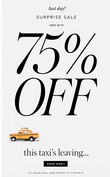
The following is an example of eye-catching and yet clean and clear use of fonts.

3. Use images of optimum size and dimensions
Images in the emails should complement the text. The reader must have a fair notion of what the email is about just by looking at the image. To make the email more aesthetically appealing, you can incorporate graphic designs, infographics, email graphics, or images. Keep in mind that images with big file sizes may slow down email delivery, and you should have a backup color in case the image fails to load properly.
Images with a higher resolution are clearer than those with a lower resolution. To keep the image looking clear, utilize photos that are twice the size dimensions of what you need for the email and then use HTML to resize them.
One of the difficulties in including images in emails is reducing file sizes to make the email load faster. The greater the file, the longer it takes for the website to load. To keep file sizes minimal without sacrificing image quality, use properly formatted files.
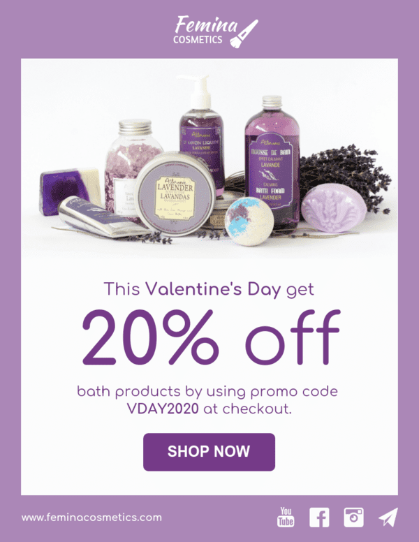
The following is an example of good use of images, colors, and fonts. Observe the clarity and effectiveness of this design.

Source: Benchmark Email
4. Use GIFs and videos, but sparingly
Apart from still images, you can also include animations in your emails in the form of GIFs and videos. They, however, have bigger file sizes than still images. As a result, you should include GIFs and videos only when they bring value to your email.
5. Have a reasonable text-to-image ratio
No matter how ambitious you may be in designing visually attractive emails, always remember that the email’s main content should be contained within the text. It’s never a good idea to send too many images in a single email. Go for 60% text and 40% images, or even better, 70% text and 30% images.
6. Use the inverted pyramid layout
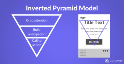
In this layout, the photos and headers are centered at the top, and the text shrinks as the pyramid approaches its tip, with a call to action at the bottom. It works incredibly well for a single-message email. However, you may use it securely for a mail with multiple messages if you apply it to each objective separately.

Source: Automizy
7. Have a mobile-friendly, responsive design
More than 50% of emails are read on mobile devices. Keep in mind when creating your emails that many people will be viewing them on their smartphone or mobile device. Your efforts, therefore, must be guided towards designing an email that fits in all of the popular screens.
8. Include your logo design in your email signature
Including an email signature to raise business awareness with a personal touch aids in the creation of a strong bond between your brand and your customers. Your company’s logo design incorporated into your email signature further imprints your brand, emphasizing its image and voice to enhance brand identification.

Source: WiseStamp
Conclusion
Without a well-thought-out email design, no matter how big your approach is, it will fail. The design of your email is critical to the success of your campaign. More importantly, contemporary trends demand appealing aesthetics and a positive user experience. As a result, it necessitates your complete focus. The 8 tips we have discussed will enable you to design eye-catching emails and succeed in your email marketing campaigns.


